Aspect ratios and composition
The aspect ratio of an image sets the stage for all subsequent composition decisions. Investigating square or panoramic compositions can help build the message of an image and inject some creativity.
Rectangular images
The most common pictures we see and sometimes hold are 4x6 inches, or in that ratio. 4x5 and 8x10 are similar, but slightly less elongate. Maybe we gravitate to this ratio as a standard because our eyes are side by side and so we view the world through a rectangular portal.
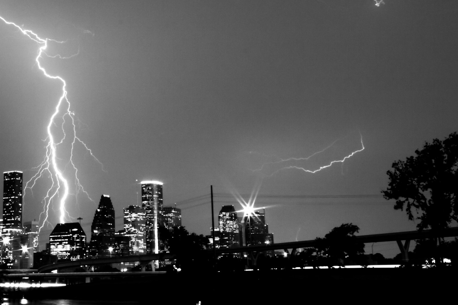
Lightning over Houston downtown. Canon T3i.
The rectangular nature of a frame lends itself to placing the subjects off center, but not too close to the edge. This concept is often formalized as 'the rule of thirds' and works well as a composition tool. Pushing the subject off-center provides air and potential negative space on the opposite side of the image.
A point to note - slightly off center subjects, and those too close to the edge, can make the image look poorly executed. They either need to be in the center, or a significant distance from the center and the edge of the frame. Of course, intentional violation of these guidelines can produce some wonderful compositions, too.
Panoramas
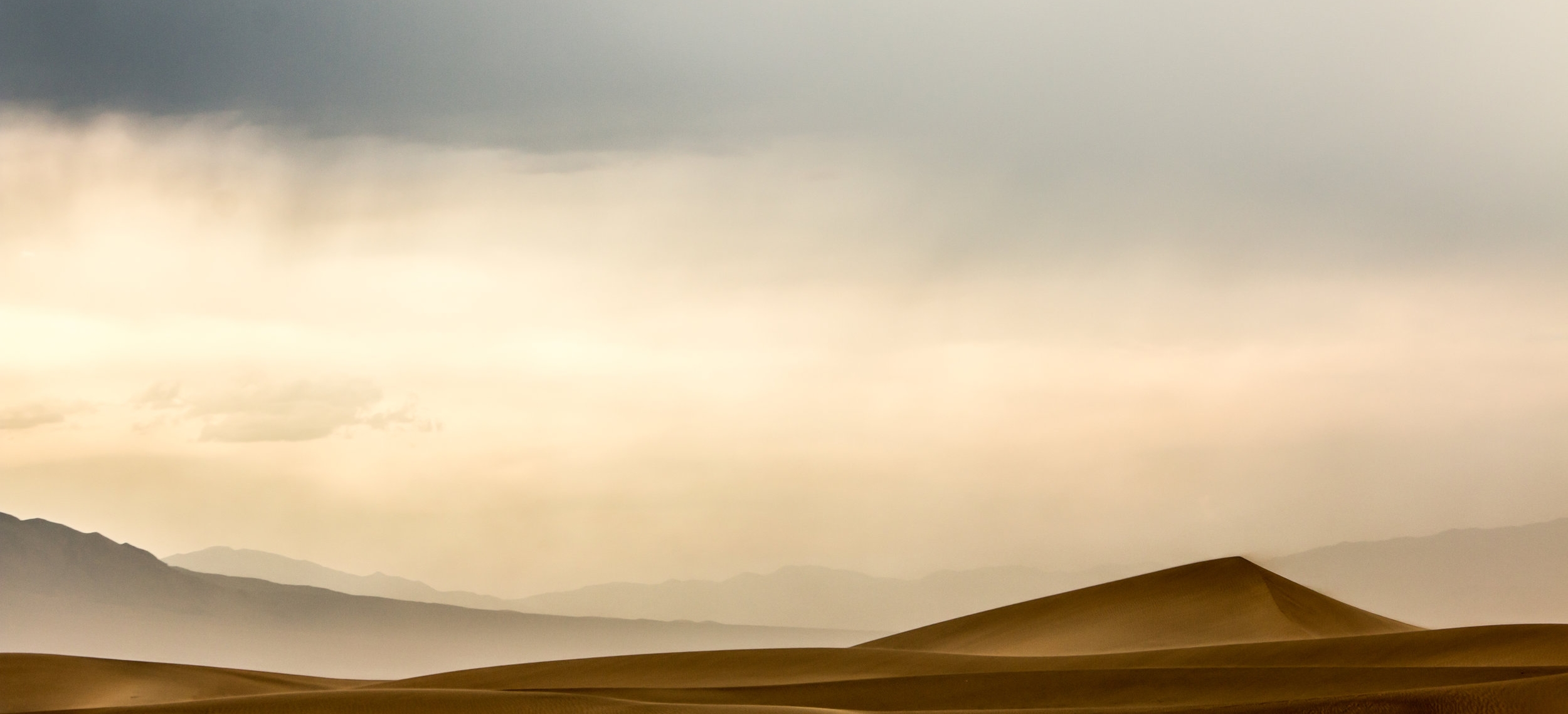
Panoramas are simply images with wider than usual aspect ratios. We are in the territory of 16x9 and beyond here. Either cropping or stitching together multiple images can produce the required ratio. I adore 16x9 because it looks like a still from a movie, with the bonus that is fits TV and monitor screens efficiently. Composition rules break down as the ratio gets wider, and there has to be enough interest throughout the frame to keep the viewer's attention.
Death Valley Dune. Canon 70D.
Square images
Even though most 35mm cameras default to a 4x6 ratio, you can always crop to square if desired. I often find that intentionally shooting with a square crop in mind works better than shooting rectangular and cropping opportunistically later. I use a 6cm by 6cm medium format camera which by design produces square images.
With square images, the rule of thirds is a little harder to execute. If a subject is off center, it is already close to the edge of the frame. Thirds are easier to deal with if there are multiple points of interest in the photograph that balance each other out.
In the example image to the right, I tried to place the heads of the subjects on the third intersections, and there is an implied diagonal as the faces look at each-other. Framing each face with the door-windows is icing on the cake.
Symmetry with the square frame feels strong and much more at home than with any rectangular aspect ratio. It can make the subject incredibly dominant - there is no where else for the eyes to look. Dead-center portraits and straight-on views of buildings work well.
Lastly, the idea of vertical or horizontal framing is not a consideration when making a square image. This has its pros and cons, but I like having one less variable to explore so I can concentrate on other composition decisions.
Coffee shop portait, Houston. Hasselblad 500cm, Ilford HP5.
Wainhouse Tower, Halifax, UK. Hasselblad 500cm, Ilford HP5.


